Task #7374 (closed)
Opened 8 years ago
Closed 7 years ago
WEB: UI layout review
| Reported by: | atarkowska | Owned by: | saloynton |
|---|---|---|---|
| Priority: | major | Milestone: | Usability Backlog |
| Component: | Usability | Version: | n.a. |
| Keywords: | n.a. | Cc: | wmoore, saloynton, jburel |
| Resources: | n.a. | Referenced By: | n.a. |
| References: | n.a. | Remaining Time: | n.a. |
| Sprint: | n.a. |
Description
The ticket to identify and document the work for the development of layout changes with the OMERO.web. Currently we have various layouts for Webclient, Webadmin, etc. It is important to make it consistent and configurable.
Attachments (15)
Change History (33)
Changed 8 years ago by atarkowska
comment:1 Changed 8 years ago by jmoore
comment:2 Changed 8 years ago by szwells
Josh posted since I started my comment...
I am liking the changes overall. They broadly mirror the approach we have taken with the websilo.
My only criticism, and at the risk of opening a can of worms, is the Basket being in such a prominent position on the page -- it is in the screen region that most eye-gaze studies indicate people look at most often yet I would hazzard a guess that it is a less used feature (although necessary and important). An additional point is the naming of Basket which carries a lot of baggage and assumptions from other contexts. It just doesn't feel quite right and carries an additional cognitive burden, although I don't have a better alternative.
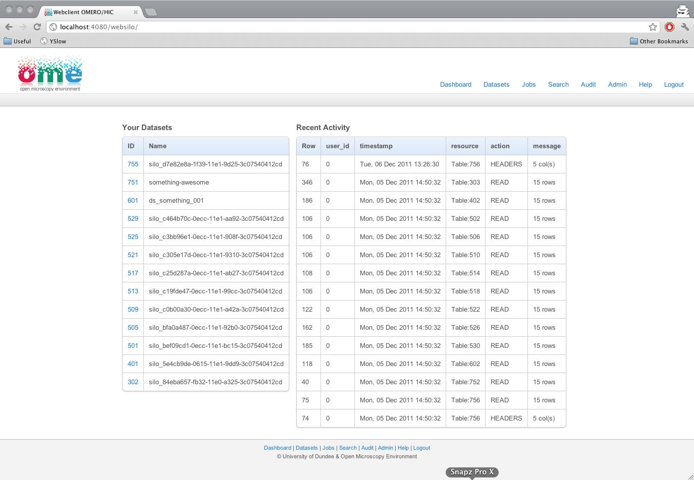
Changed 8 years ago by szwells
A Screenshot from websilo as a comparison between omeroweb UI changes & an extant omeroweb derivative
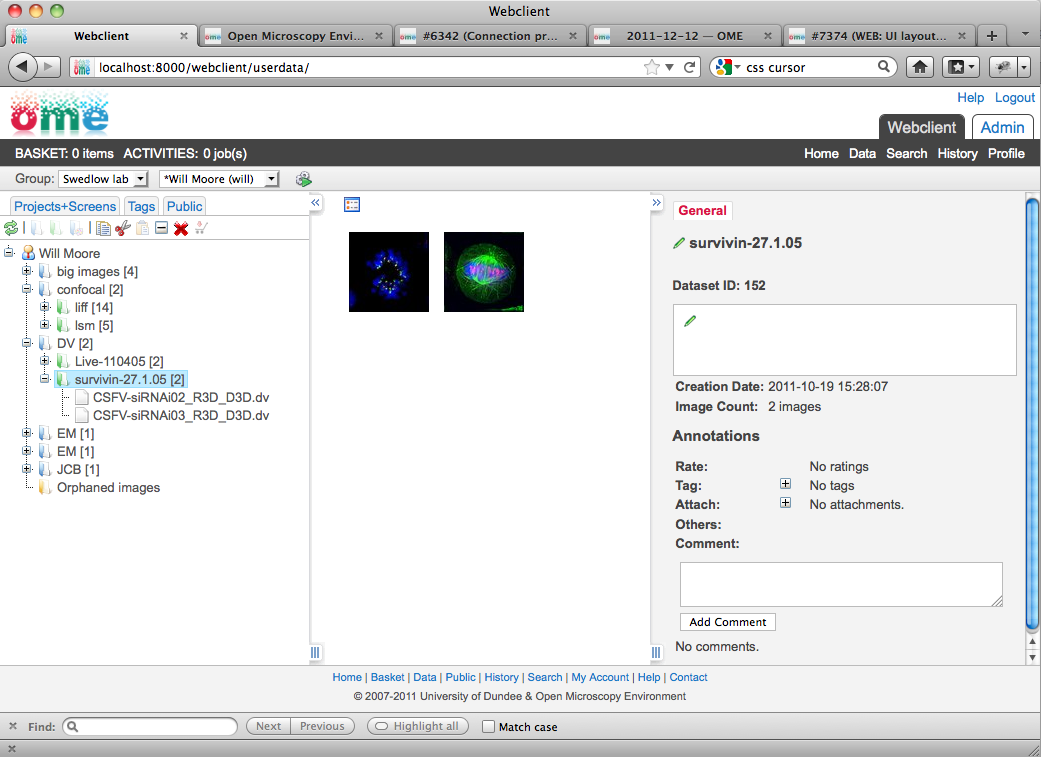
comment:3 Changed 8 years ago by wmoore
All of those tab / link groups are potential sites for extension. E.g. use SETTINGS:
TOP_LINKS = [["Admin","webadmin_home"], ["Support", "feedback_home"]]
etc. where you can get the link via E.g.
>>> from django.core.urlresolvers import reverse
>>> reverse("webadmin_home")
There's no specified mapping between the 4 menus and E.g different web apps.
We're unlikely to use "Webclint" as a link. Not sure what's best.
I guess that "Basket" and "Activities" functionality might be moved from webclient to 'common' app to be available to other apps without webclient turned on. But we haven't decided exactly what parts of webclient should be 'common'. Maybe if everything in webclient is re-usable then it should just stay in webclient and we shouldn't turn off webclient, just disable some pages?
Changed 8 years ago by wmoore
Changed 8 years ago by wmoore
Changed 8 years ago by wmoore
Changed 8 years ago by wmoore
comment:4 Changed 8 years ago by wmoore
- Cc saloynton jburel added
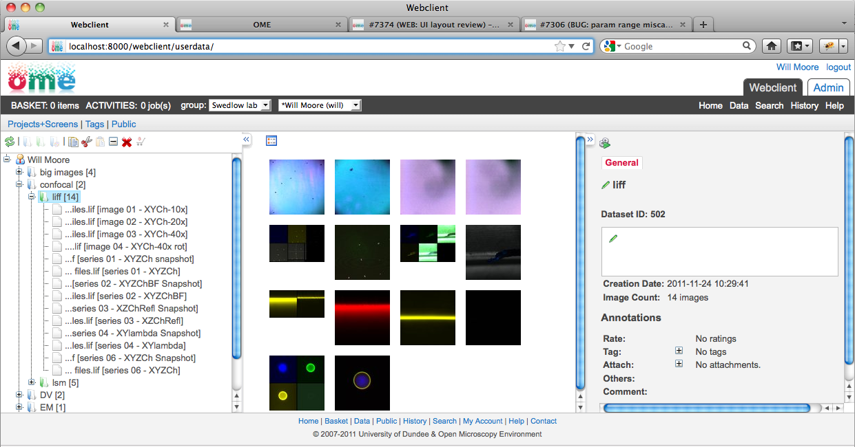
Discussion on web/insight layouts (wmoore, jburel):
- Toolbar at the top of right-hand panel in Insight will go (#7696, #7697):
- Actions relating to specific object (Image, Dataset etc) will go down into panel
- General actions (upload or run script etc) will go in main toolbar.
- Activities and Basket will stay where they are in web (in dark toolbar above main toolbar)
- These will become icons, so as not to be too in-your-face when not needed
- When they have items in them, they will be highlighted to indicate (like facebook).
- Other web improvements we discussed:
- Fewer icons in tree tool-bar (E.g. group "new" actions into a single button (as in Insight), same with "edit" actions?
- Thumbnails should indicate where they will appear during loading, e.g. square gray background (will need to go white once loaded)
- Slightly larger text for Dark toolbar right-hand links: "Home", "Data", "History" etc.
- Chooser to switch user: Display user names? Can lead to long text. But I like the group and user choosers looking similar.
comment:5 Changed 8 years ago by saloynton
Some questions on the locations of the activities and basket option.
- The use of icons could take the understanding backwards.
- A basket icon is used in the shopping context and has the right affordance for this. Our use of a basket icon does not hold the same affordance. i.e. we are not necessarily buying the images but using the basket as a placeholder for the images. This to me seems a looser use of the icon and in the context of the web client and what we are wanting is a box/container icon.
- Given the current location top left the location carries with it a lot of user focus i.e this would be where important buttons are located. (See http://www.useit.com/alertbox/horizontal-attention.html)
- Based on this I would argue that activities and the basket do not require key left hand position.
- The suggestion if we would like to move towards icons it may be better moving them up into the main toolbar.
comment:6 Changed 8 years ago by wmoore
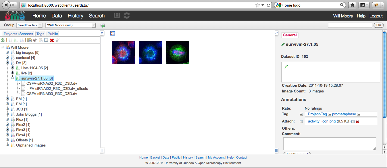
Using icons for activities and basket. http://trac.openmicroscopy.org.uk/ome/attachment/ticket/7374/Screen%20shot-2011-12-21.png
Icons are faded when no items in basket/activities.
Basket is a 'box' icon.
comment:7 Changed 8 years ago by saloynton
I do like the selection of the box and indication of items inside it, does anyone else think is it clearer or more difficult to understand?
comment:8 Changed 8 years ago by jburel
Will and I discussed that (see earlier comments). we said that we will try the icons a la "facebook".
A presentation to the rest of the team will be scheduled for January.
comment:9 Changed 8 years ago by saloynton
ok thanks, will some feedback in front of users need to be scheduled after the team presentation. I only ask for the possible planning for gathering a few people either internally or externally and allowing for a few iterations of feedback in the new year.
comment:10 Changed 8 years ago by wmoore
New screen-shot with links moved to the left.
https://trac.openmicroscopy.org.uk/ome/attachment/ticket/7374/Screen-shot-2011-12-22.png
The reason is that I found when I used the basket icon (on the left) to go to the basket, then I found it hard to look over to the right to find the "Data" link to bring me back again.
Also 'Profile' remains on the right, with the user's name (seems conventional, and also removes it from the main menu links where it didn't really belong).
Changed 8 years ago by wmoore
comment:11 Changed 8 years ago by wmoore
Discussion with Scott - Aims of the web redesign:
- Good usability for web users
- Good usability for web developers (us and 3rd parties)
- Consistency with Insight (where this doesn't impact on above aims)
Summary of a long discussion
We are basically happy with the overall web layout:
- Tabs for web applications (Webclient, Admin etc)
- Top-level links (dark toolbar)
- Thin toolbar (NB: this is mostly equivalent to Insight's toolbar)
- 3 columns with tabs/accordian at the top level of each, toolbars inside each tab pane
This provides plenty of space. It may look a little sparse right now, but this allows extension in a number of points without mixing the type of links in any particular toolbar.
We may still want to move around various links/icons etc. E.g. activities, basket, log-out, user-profile, help etc, but this doesn't affect the underlying template. Finalising the template is the first step, since we can then write the docs etc. HIC guys can start using the templates and we can fix any issues they have.
Comparison to Insight
Insight uses accordian which allows a larger number of left panels than tabs. Also has application menu. In web, we have additional toolbars / links at the top of the page. Therefore, some of the additional accordian tabs that Insight has will be implemented as higher level links / tabs in the web. E.g. Administration, Search, History.
Changed 8 years ago by saloynton
A general collection of ongoing ideas covering the variations of the interface in preparation for a wider design review.
comment:12 Changed 8 years ago by jmoore
Will, my first reaction is that the saving of space is worth it. But the size of the "Home" "Data" "History" and "Search" bits seem to overwhelm the rest. Also, where's "admin"?
comment:13 Changed 8 years ago by sylittlewood
Is there a bit of repetition with there being a 'Search' menu item and also what looks like a search box on the right hand side?
Maybe consider having the search box with 'Search' as the button text and also an 'advanced' link to the side for more specific searching?
comment:14 Changed 8 years ago by wmoore
comment:15 Changed 8 years ago by wmoore
New Container borders, drag handles etc.
http://github.com/will-moore/openmicroscopy/commit/6f7ee1a8a2bdbabe3040b0d00af03c96ddc8701a
Screen-shot:
http://trac.openmicroscopy.org.uk/ome/attachment/ticket/7374/Screen%20shot%202012-01-25%20at%2011.59.14.png
comment:16 Changed 7 years ago by Will Moore <will@…>
(In [0623ea7069d402b916f7f064158141640766ef45/ome.git] on branch develop) Re-arranging blocks in base_header.html. See #7374
comment:17 Changed 7 years ago by Will Moore <will@…>
(In [bb8170f08c4d19d3d925e6aab0d3685aa58aa392/ome.git] on branch develop) NEW UI: thinner header. See #7374
comment:18 Changed 7 years ago by wmoore
- Resolution set to fixed
- Status changed from new to closed
Further UI developements are under #8287. Closing...

What's the reason behind (and the extensibility of) the 3 tab groups (and the one link group):
Also: we'll need to unify the footer text with the rest of the tab content, likely also in an extensible way.
Something else: is there any problem with having "Admin" or say an extension tab use the basket and activities? If not (i.e. if we're going to allow/encourage people to do so) do they need to be located somewhere "above" the "Web client" tab?